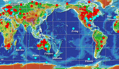
This is a continuously variable proportional circle map. The map is of the known craters on the Earths surface. The size of the circles are proportional to the actual size of the craters.
A Univariate choropleth map is a choropleth map that only shows one variable. In this map it shows the percent of Pacific islanders living in Auckland, New Zealand.
A bivariate choropleth map is a variation of a normal choropleth map. It shows two different variables. In this map it shows the population and the median home value. It is interesting to see the home values in the more or less populated areas.
A DOQQ map is an aerial picture that is geometrically correct. The scale is correct and you can use the map to measure distance. in this map the scale is correct and would be a good map to use to see how far something's true distance is.
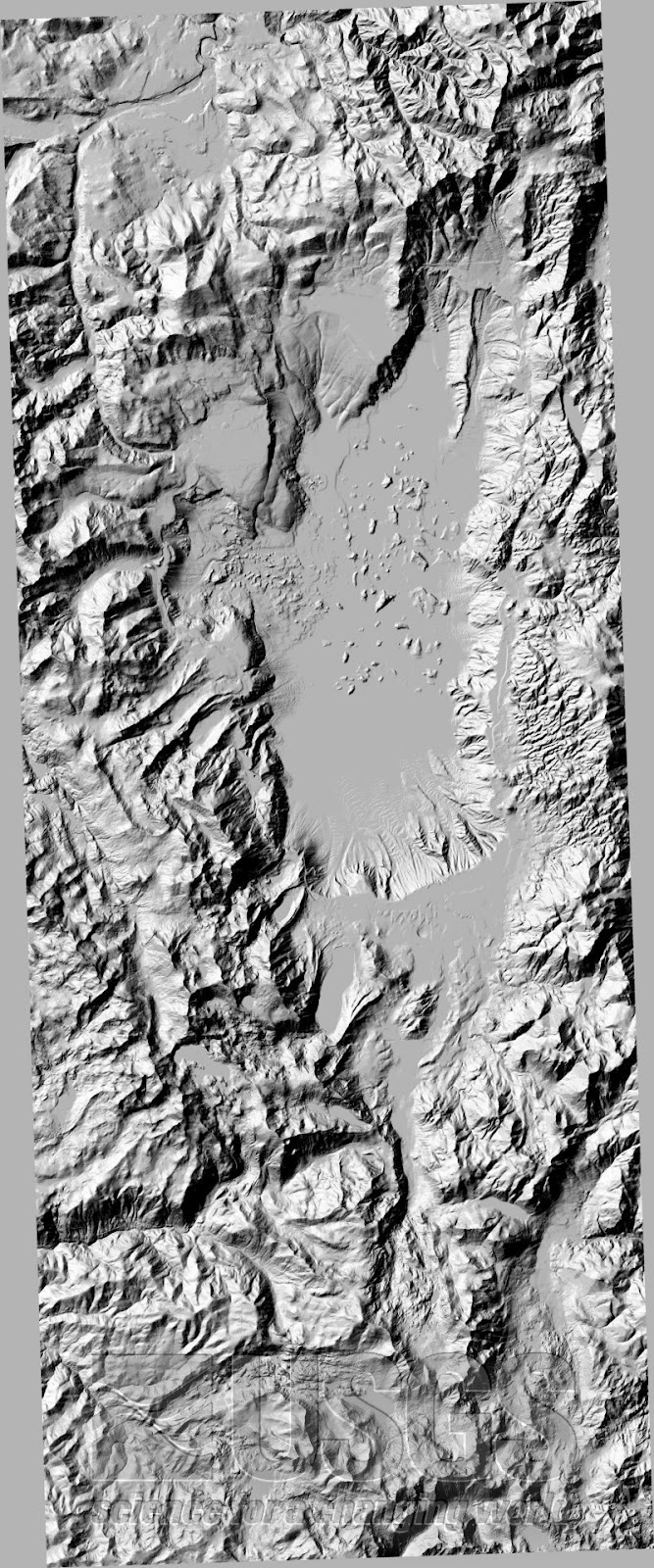
A DEM map is a map that shows a 3-D representation of the Earth's surface. This is a DEM map of Lake Tahoe from the USGS. You can see where the lake is in the the center and see the much taller mountains surrounding it.
A dlg map or digital line graph is a map that uses different shapes or lines or curves of different colors to represent different data. This map is of Lake Tahoe and the different lines represent different areas and sections of the whole lake area.
Infrared technology is a very important technology. It is sensitive to different spectrums of light and is able to show changes to the environment and other similar things. This is an infrared aerial photo of the Lyndon Johnson Ranch in Texas
A choropleth map is a map that has a theme and uses colors or shades to show the measurment of what is being mapped, the theme. In this case the theme is of population in Europe.
A stem and leaf plot is a statistical way to show quantitative data. In this plot it is showing the ages of people at a family reunion. The ages range from 1 to 81
Index value plots show current trends and also let you compare them to past trends. This map is showing recessions in the USA. And it shows you the border between recession and not.
A classed choropleth map is a map that uses data already collected and aggregates it. In this map it is comparing the ratio of women to men across the USA
A triangular plot, is a graph shaped like a triangle. The triangle shows the composition of something consisting of three variables all adding up and completing the triangle. In this example you can see the make up of the triangle.
A bilateral graph is a type of bar graph that has many bars comparing different data. In this example you can see the amount of trade in different categories like exports or imports.
A boxplot is a graph that shows groups of numerical data. In this example you can see the three different groups. The boxplot is depicting lottery payouts and you can see as the years progress the payouts become smaller and closer to the median.
Histograms show data, they show the spread of the data, if there are any outliers, and it shows the average data and which occurred most. This map is just a simple example of that. We can see that in between 299.8 and 300 was the most frequent data
The isotachs on this map show areas with corresponding wind speed. on maps like this, you can see many different isotype lines completing a weather map.
A black and white aerial photo is taken from high above to get an aerial view over a wide range. It is used to get information on a big area that is not easy to obtain from the ground.
This isoline map is showing precipitation in Washington State. The isolines link areas that have the same amount of precipitation. Closest to the coast and east of the mountains has the most because of orographic effect.
This is a dot distribution map that each dot represents population around lake St. Clair. This particular map was showing the effects of population on the lake.
A topographic map is a map that shows relief features such as elevation, using contour lines. As you can see in this map the contour lines are representing different elevations.
A cadastral map is a map that shows how land is parceled out according to ownership. This is a simple cadastral map that shows land parceled out along the Georgia coast. Sometimes these maps can go into more detail.
A planimetric map is a map that shows only the horizontal positioning of things and does not take elevation into account. As you can see this map just shows a street with businesses on it and pays no attention to elevation.
This is a mental map that I created showing the route that I take from my home in Fort Lauderdale to my apartment in Tallahassee. These are the driving directions and show my preference of roads to take.
The Public Land Survey System was a system used to survey and divide land . The system was started a little bit after the American Revolution and made it easier for the "country of Yeoman farmers" 1. to head out west. This is a map of ohio being parceled out.
This is a hyposemetric map of France. A hyposemetric map shows different elevation using colors and other variables. In this map you can see the sea, and then going inland the elevation rises.
This flow map tracks cases of west nile virus across the USA. The different colors represent how far the state is from the Mississippi river and the height is proportional to confirmed cases of west nile
This circle map shows the american indian population of Western States in America. The circles are proportional to a range of numbers representing population.
This is just your simple wind rose map. These maps show from what direction wind is coming and also at what speed. They were used before compasses were invented at let people know what direction certain places were located relative to a set location.
This isopleth map shows the number of deaths by the h1n1 virus, or swine flu. The different lines and different colors mark the areas the number of deaths that occurred there.
This isobar map shows the atmospheric pressure across the United States. Low and High pressures are clearly visible across the map. The average atmospheric pressure on earth is 1013
This Lidar map shows the topography of the sea floor near the south Moloka'i Reef's. Maps like this are extremely important in guiding ships in and out of ports safely.
This Thematic map shows the overall trend for each state's control of the Governors' office in 2007. You can see some trends such as the deep south being mostly Republican or the Pacific northwest being mostly Democrat.
This cartogram shows a map of the world. It looks a bit funny doesn't it? That is because each country is proportioned to reflect the GDP it puts out every year. You can see the United States are very large as is Japan, but you can barely see Africa
This population map, shows the earths population. It also shows how many people on Earth live with or live without AIDs. As you can see the Earth's population is more young people which means its growing, but it is still sad to see how many people live with AIDs
This is map showing land Israel has conceded over the past 40 some years in order for peace. This is not entirely true, This is a propaganda map trying to show that Israel is the only country in the region trying to achieve peace, however from a global survey, most citizens of the world say Israel is the biggest threat to world peace.


 \
\


